And, as Delroy Lindo said in Get Shorty, "The real question is, where's he been?" It has been a long time since I've done an update.
To sum my thoughts: we are in an oversold bounce, and the question is for how long. I do not anticipate a sustained rally but it is not impossible to foresee. I will take it one day at a time.
Anyways, here for a more meaty update. My thoughts are that it looks like we have a bounce here in the works but it needs to follow through tomorrow. If it can succeed, it may see anywhere from 800 on up to 950, although 800 is going to be stiff. We do not have a follow through on today's move yet so it is too soon to tell. However, I am prepping myself to take more intermediate term positions soon. Some of my comments on the charts below will reflect some restraint and perhaps a tone of bearishness. It is simply too soon to call a bottom without some kind of confirmation. However, the prospects of finding a bottom are higher now than perhaps they were. That does not mean a new bull market, but it could mean a tradeable range for a few days, weeks, or maybe even a month or two. It is not out of the realm of possibility to see even a 20 - 30% rally, but I would not jump on board until some indication shows up to the party.
So here we go, a look back in time to 2003. Right now I think this "bottom" (if it is that) has many similarities:

(Note: all charts produced by Gannalyst and NinjaTrader software, and NinjaTrader does do some wonky stuff with text... hope it is legible)
To begin with, however, here is a picture of market geometry on the weekly chart going back to 1990 (click to enlarge).

Once I determined what I feel is the geometric midpoint of this range, then I was able to tease out some internal geometric lines of support and resistance. No rocket science here, just a few Fibonacci tools. This chart is meant to serve as a reason as to why we may expect congestion in our current place.
Next is a tribute to the one person that may be the greatest trader who ever lived, W.D. Gann (a man who called the 1929 top and bottom in advance, including the timing of the events). Gann used angles on charts that he called "moving averages" which are not price moving averages that we are accustomed to today. Instead, these are more akin to geometric moving averages. Think of a moving average that considers price and time instead of just price. A 1:1 Gann angle is the major line of a trend. Breaking that is considered weakness or strength. It is generally expected that when a 1:1 line is broken then the 1:2 line is tested. The 1:1, 1:2, or 2:1, 4:1, etc. are all ratios - i.e. one dollar per time unit moved on a chart would be 1:1.
Anyways, here is a Gann chart with these same fibs as above. Note how we are hitting a long term Gann line dating back to 1990 (click to enlarge).

That is simply meant to explore some other reasons why we have some congestion here.
With a little more fiddling you can see where some Gann lines cross and how those can mark significant market points (a reversal, a support/resistance break, etc. etc.):

One last Gann trick to show, zero lines. These are angled lines drawn from a price of zero at major market points. These are the heavy green and purple lines. Note, I hid some of the lines so it doesn't continue to look like spaghetti:

That and the timing comment are simply meant to give a *possible* conjecture out into the future in terms of timing. W.D. Gann had a whole host of other tools that I am not delving into here, but I may try some others at a future date soon.
However, knowing support resistance can be a bit less than complete. We need to look at some indicators.
Let's clear the air and show why there is no need to rush out to catch a bottom for the next bull market. We are far away from that (Note: this is an indicator created by Constance Brown in her book Technical Analysis for the Trading Professional. Her Composite Index is also used below in other charts):

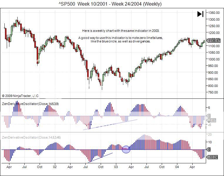
Let's zoom in with the same indicator on 2003:
Now look at 2009:

Getting close but no confirmation yet on this indicator.
Now for the RSI and the Composite Index. To me, the Composite Index gives a leading edge to the RSI and helps to determine what it may be doing a little in advance. First 2003:

Now 2008:

Looking like something to the upside is brewing. Maybe not yet, but getting close.
Now to turn to some statistical indicators. Here is a smoothed Standard Error band, the Adaptive CCI, and the R-Squared. The Standard Error band helps to identify trend movement (similar to a Bollinger Band), the Adaptive CCI is a CCI indicator that takes cycle information into account, and the R-Squared indicator shows strength of trend (high or increasing is strengthening trend, low or decreasing is weakening trend or just no trend/chop).
Here is what it looked like in 2003:

Here is what it looks like today:

And for my final party trick here is the daily:
RSI/Composite:

And Adaptive CCI/Smoothed Error/R-Squared:

Feel free to judge for yourselves. I personally am not looking to go aggressively short here (which may be common sense), but it is possible that I could be wrong. I just don't want to end up like this:

1 comment:
Nice stuff. I see you point, Mr, Connie Gann Zen.
Post a Comment